Responsive Design
The other aspect this tutorial covers is responsive design. The main concept behind responsive design is to have a single HTML representation, which uses CSS to dynamically adapt the display to different screen sizes. The majority of these changes is possible via CSS, but later on in the responsive re-design we will also look at turning on and off features based on screen size using JavaScript.
When implementing responsive design the primary paradigm is what is known as “mobile first”. This means that we first design the layout of each page with display on a mobile device. Then we add the necessary CSS classes and CSS code to adapt the layout to those displays where we have more space available. While we could also do it in the opposite direction, building mobile-first results in interface designs that adapt better to the different screen sizes.
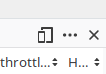
Testing on mobile devices is difficult, as there are so many different device sizes. Luckily, modern browsers all provide an environment for simulating other device sizes. In all of them you access this via the developer tools (usually accessed via the F12 key). There, the icon for responsive design tends to look something like this:
Firefox: The responsive design button is the icon that looks a bit like two different sized mobile devices (third from the right)

Chrome: The responsive design button is the icon that looks a bit like two different sized mobile devices (second from the left)
Click on the icon to turn responsive design mode on or off. When responsive design mode is on, you can resize the display area to any dimension you like or via the toolbar at the top, you can select device sizes from a pre-defined list.
Basic CSS Adaptation
Before we can start to implement the responsive design, we need to tidy up our classes. First, update app/templates/application.hbs to:
Next, update app/templates/modules/index.hbs to:
Finally, we need to delete any col-lg or col-md classes in the components app/components/modules/modules-list.hbs and app/components/modules/modules-navbar.hbs. With that done, it is time to work on the responsive design. The class gx-0 removes the gutters that bootstrap would create otherwise which would let the background color show through our elements.
If you activate responsive design mode and set the size to a phone-size and then navigate to the list of modules, you will see that the design really does not work and requires horizontal scrolling, something that should always be avoided on mobile devices. Taking a mobile-first approach, on a small screen, we really want to have the menu displayed above the table. To do that, update app/templates/modules/index.hbs to:
While up to this point we have let the browser decide how wide to make the menu, we are now explicitly giving it a width. Most modern CSS frameworks use a grid structure to define grids, with 12 columns per grid. Here, by specifying col-sm-12 we state that we want this element to have 12 out of 12 columns of width (effectively the full width of the page). As both the ``<div>``have their width set to the full width of the page, they cannot both fit onto the same line, thus the browser wraps the second element into a new line. This already looks much better, although the table still requires scrolling, which we will fix a bit later.
We will look at how these two elements should behave for larger screen sizes, first. If you increase the width of the display area, you will see that as we go wider, there is quite a bit of wasted space next to the menu and in the table. This is because any layout defined at the “small” scale is also applied to larger scales. We thus need to add extra CSS classes to override the small layout at larger sizes:
By adding the two medium-X classes, we now provide a slightly different layout for medium-sized screens. The first column of the grid is set to be 3 columns wide (25%), while the second one is 9 columns (75%). As this now fits into a single 12-column row, both will be displayed next to each other, with the respective relative sizes. If you now resize the display window, you will see that when the width hits a certain point, the layout changes from the small vertical layout to the medium-size horizontal one. If you increase the size to the full width, then you will see that again we get excessive white-space, thus add additional CSS classes:
<div class="col-sm-12 col-md-3 col-lg-shrink">
  ...
</div>
<div class="col-sm-12 col-md-9 col-lg">
...
For the final large layout we don’t use specific widths, we tell the browser that the menu area should take up only as much space as it needs for its content (shrink it down to what is needed) and the table area should take up all remaining space. If you now play with the screen width, you will see that the layout adapts nicely to the full range of screen sizes.
Custom CSS Adaptation
However, at the small size, the table still exceeds the available width. To address this we will have to add some custom CSS in the app/styles/app.scss:
/*
 * Responsive Table
 */
@include media-breakpoint-down(md) {
    table thead {
        display: none;
    }
    table tbody td {
        display: block;
        width: 100%;
    }
}
When we adapted the layout using the CSS classes, we used three different levels: small, medium, and large. In CSS parlance these are generally known as breakpoints and we can use them when we create our own table-specific CSS. The Bootstrap CSS framework we are using provides some helper functions for dealing with these breakpoints in the form of the `media-breakpoint-only, media-breakpoint-down or media-breakpoint-up mixin function. This first function takes a single parameter, that defines which breakpoint the CSS rules contained within the mixin are to be applied to. In this case we specify that they should apply to the breakpoints below md and should not be used for the medium, large or even larger breakpoints. That is because for those sizes we want to show the table normally.
The two modifications we make for the small size are that we first hide the table header and then in the table body we set each table cell (the <td> elements) to be displayed as a block element with a width of 100%. The effect of this is that at the small size the table is reformatted from the horizontal layout into a vertical layout which works much better on small devices.
The vertical display is a significant improvement, but on a small display there might still be too much information that is perhaps not needed at that point. To address this we can then add some more CSS classes into the template to hide things that perhaps are not so necessary in the small display:
JavaScript Adaptation
The final adaptation we want to make to the list of modules is to change the direction of the menu. For the small breakpoint we want the menu to be horizontal, but for all other sizes we want it to be vertical. To implement this we will create our own media query service:
$ yarn ember generate service media-query
We will only build a basic media query service that distinguishes small from not-small breakpoints. Update the code in app/services/media-query.js to this:
import Service from '@ember/service';
import { tracked } from '@glimmer/tracking';

export default class MediaQueryService extends Service {
    @tracked breakpoint = 'sm';

    get small() {
        return this.breakpoint === 'sm';
    }

    get notSmall() {
        return this.breakpoint !== 'sm';
    }
}
The service has only one property, the breakpoint which we initialise to 'sm', due to the mobile-first approach. Then we define two getters small and notSmall. The first returns that the breakpoint value is 'sm', the second that it is not.
With that in place, we now need to actually determine what the current breakpoint is. To do this we will implement the init function and there use the window object’s innerWidth property to determine how many pixels wide the browser window is wide. The Bootstrap CSS framework by default uses 768px as the boundary between small and medium and 992px as the boundary between medium and large. Thus we do that as well, by adding the following code:
import Service from '@ember/service';
import { tracked } from '@glimmer/tracking';

export default class MediaQueryService extends Service {
    @tracked breakpoint = 'sm';

    get small() {
        return this.breakpoint === 'sm';
    }

    get notSmall() {
        return this.breakpoint !== 'sm';
    }

    init() {
        super.init(...arguments);
        if(window.innerWidth >= 992) {
            this.breakpoint = 'lg'
        } else if (window.innerWidth >= 768 ) {
            this.breakpoint = 'md'
        } else {
            this.breakpoint = 'sm'
        }
    }
}
Warning
Should you use Visual Studio Code your linter might highlight the entire init-function as an error since the service is not marked as classic. Since this tutorial has been rewritten from an older version of Ember, I left this code mostly as it was and just modified it to the actual Ember version. Despite the thrown error, the code should work.
This will initialise the breakpoint correctly, but will not react to changes in the window’s width. To handle these changes, we add an event listener to listen for the resize event. When the event fires, we update the breakpoint:
import Service from '@ember/service';
import { tracked } from '@glimmer/tracking';

export default class MediaQueryService extends Service {
    @tracked breakpoint = 'sm';

    get small() {
        return this.breakpoint === 'sm';
    }

    get notSmall() {
        return this.breakpoint !== 'sm';
    }

    init() {
        super.init(...arguments);
        if(window.innerWidth >= 992) {
            this.breakpoint = 'lg'
        } else if (window.innerWidth >= 768 ) {
            this.breakpoint = 'md'
        } else {
            this.breakpoint = 'sm'
        }
        window.addEventListener('resize', () => {
            if(window.innerWidth >= 992) {
                this.breakpoint = 'lg'
            } else if (window.innerWidth >= 768 ) {
                this.breakpoint = 'md'
            } else {
                this.breakpoint = 'sm'
            }
        })
    }
}
With the service in place, we can now use our new service in the component class for the modules navbar, that we need to create first by running:
$ yarn ember generate component-class modules/modules-navbar
and then update app/components/modules/modules-navbar.js:
import Component from '@glimmer/component';
import { inject as service } from '@ember/service';

export default class ModulesModulesNavbarComponent extends Component {
    @service mediaQuery;

    get actionMenuDirection() {
        if(this.mediaQuery.breakpoint === 'sm') {
            return 'horizontal'
        } else {
            return 'vertical'
        }
    }
}
The new actionMenuDirection property now reacts to the value of the small property on our service and either returns 'horizontal' if we are in the small breakpoint, otherwise it is 'vertical'. These classes do not provide anything right now, so we need to update our app/styles/app.scss file:
/*
 * Responsive menu
 */

 .horizontal {
    flex-direction: row;
 }

 .vertical {
    flex-direction: column;
 }
With that in place, we can now use the computed property in our app/components/modules/modules-navbar.hbs to change the direction of the menu:
If you now change the size of the window, you will see that on the small size the menu switches to a horizontal direction.